Lift Off Energy: Iterative Process
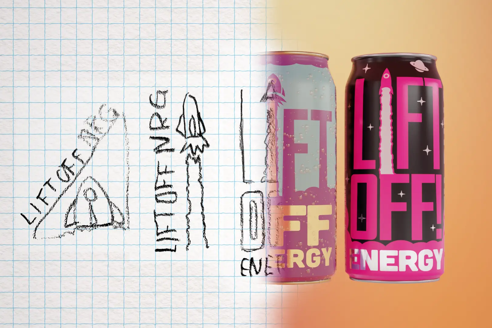
From Sketch to Final
The Lift Off Energy concept is for an energy drink company with a power-driven, yet whimsical vibe. I was inspired to sketch this design when I saw how beverage can labels could be printed with simple transparency and I wanted to see what I could come up with to leverage it. I chose an energy drink because I like the visual language that goes along with a high energy brand; a language that utilizes high contrast and bright colors. I started with initial design ideas and sketches and moved to a first draft. Tools used: pencil and paper sketch, Adobe Illustrator, Blender for 3D renders, Adobe Lightroom Classic for color grading.
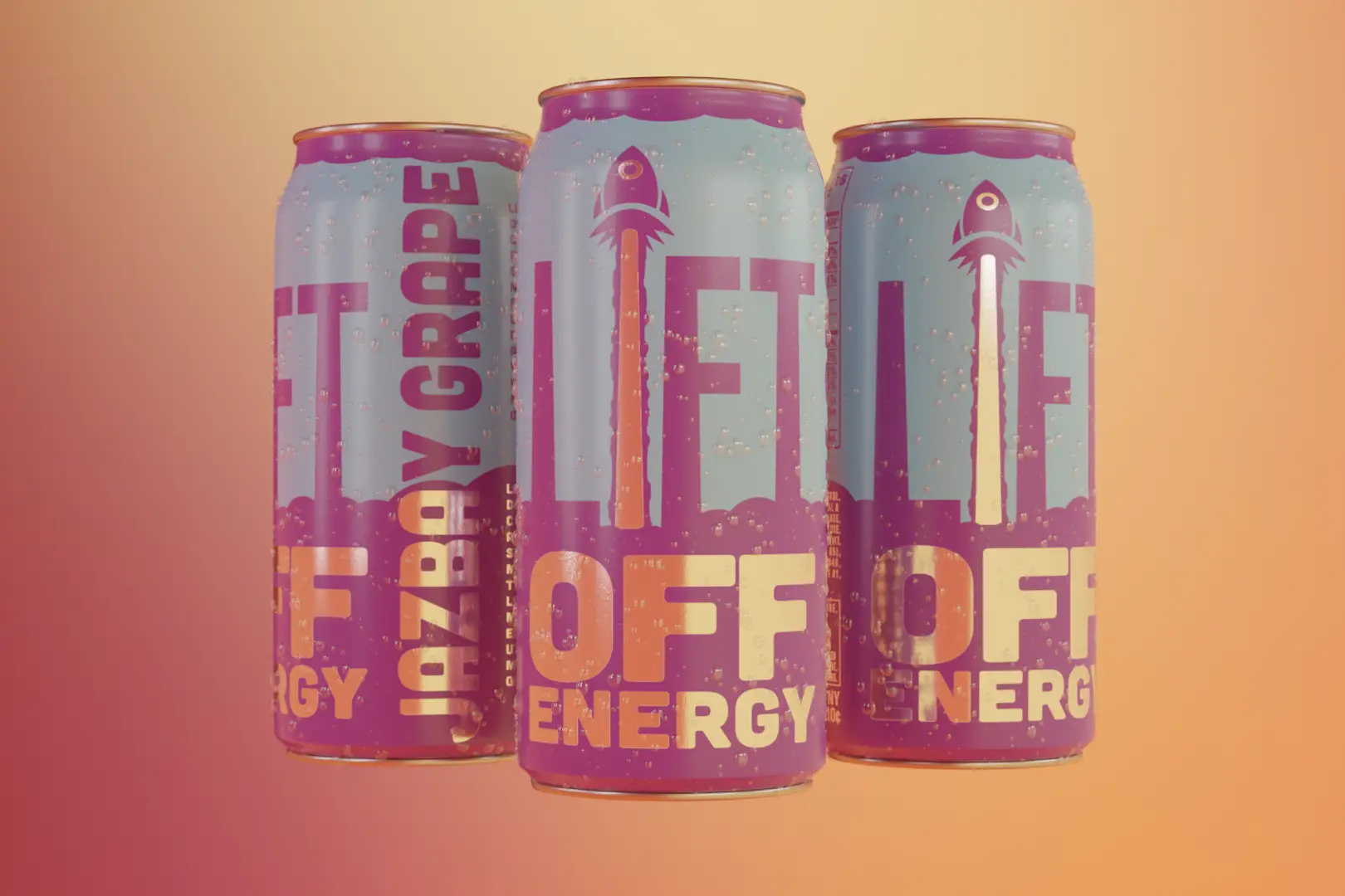
First Draft
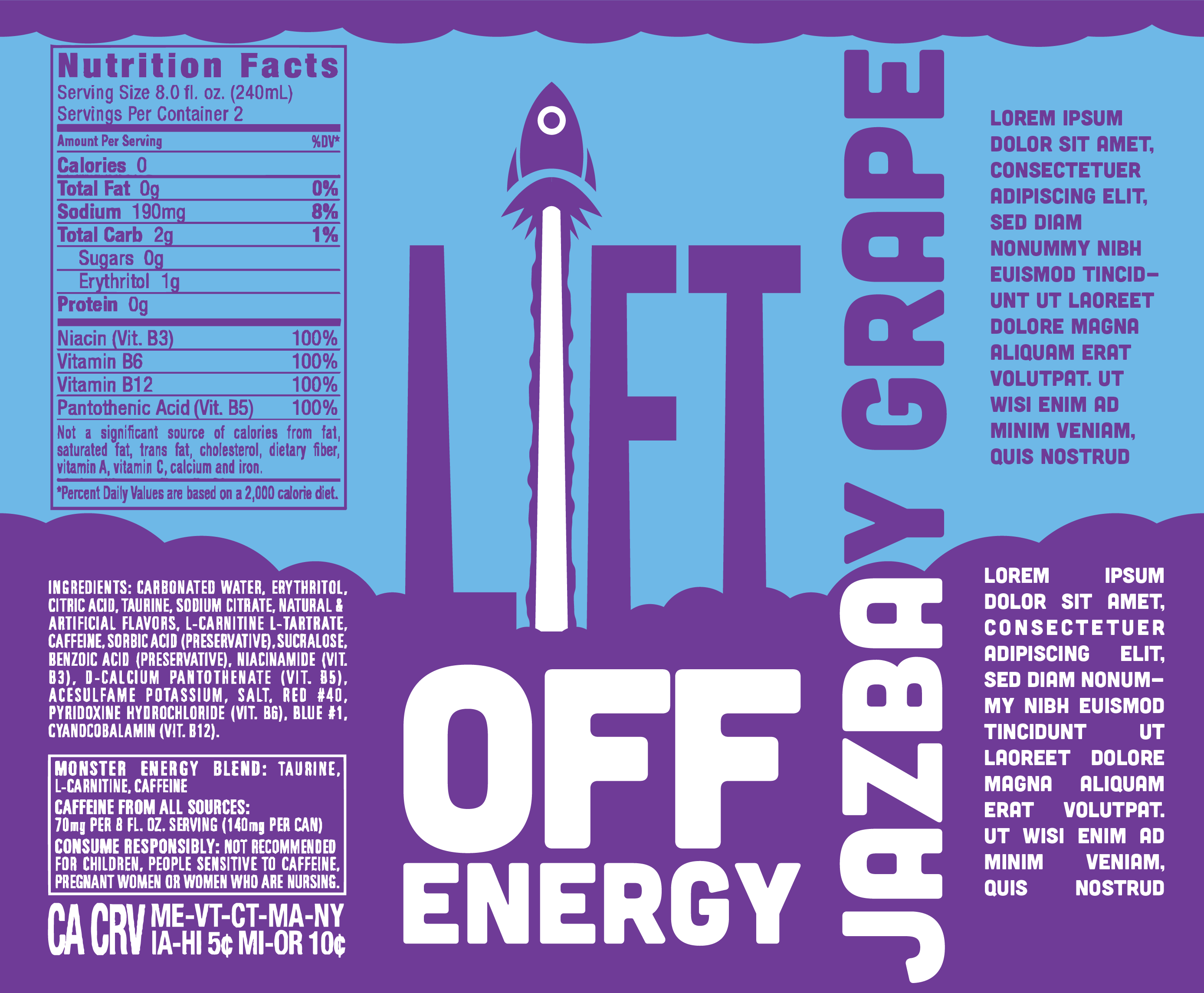
In designing the first draft, I separated the canvas into three equal parts. When I studied cans in my fridge I observed that you can see only 1/3 of the sides from any angle. I arranged the composition to match the sketch and decided on which spaces would show through to the can surface. Next, I like to render my designs in 3D space to inspect for mistakes or unintended tangents that only make themselves visible when viewed at specific angles.
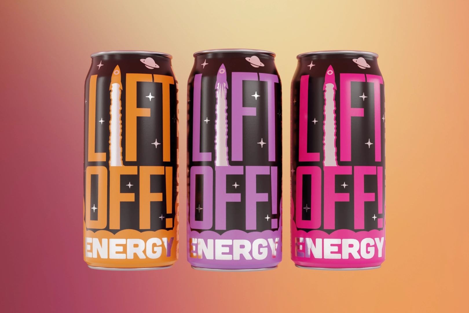
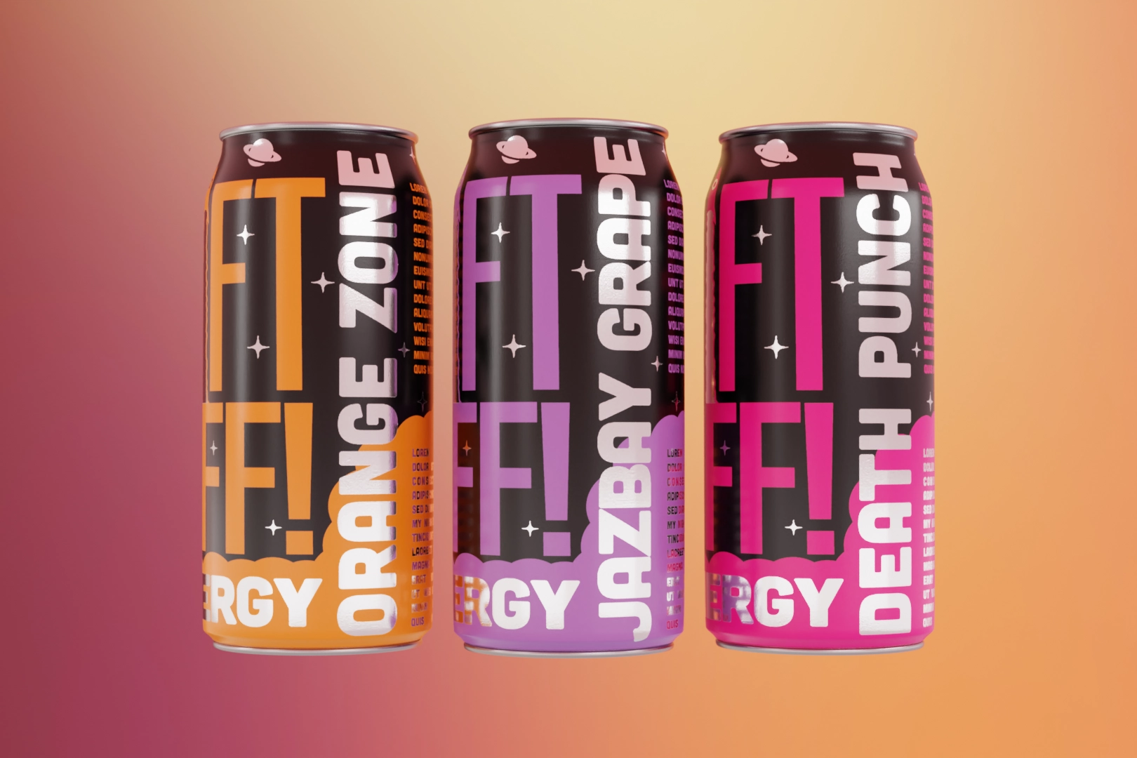
Final Form
Through multiple rounds of revisions and some opinions, I decided on a final draft for Lift Off Energy. The words "LIFT" and "OFF" are now unified and follow hierarchy rules of typography. The "white-space" of the black background has contextual elements to create contrast and interest.